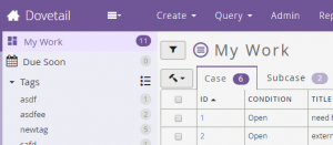
Personalization or customization of the things we use has been a standard option for users to do for a very long time and it appears almost ubiquitously in the computing world. Computer users can spend a seemingly endless amount of time customizing their desktop interface’s wallpaper, window color scheme, system sounds and the fonts or colors of their terminal interfaces.
Then imagine the number of hours spent on selecting and customizing just the right theme for a WordPress site. It has too look cool, but not like everyone else while at the same time being exactly like your favorite style which happens to be the most used style right now. Before that you’ve probably spent some time customizing your IDE or text editor of choice to look just right as well.
Certainly I’ve driven home my feeling that the ability to customize a workspace to suit an individual is of utmost importance after the core features are done. Just over 3 years ago I joined a team working on a product called Dovetail Agent, a replacement for the Clarify client, which is customizable to suit each customers use case and installed on site . They might add or remove some feature or form field and would always change the logos and a color or two.
First Misguided Attempt
Nearly 3 years ago now I started my first attempt at theming this product through a desire to have a dark theme. The product itself leverages several other components that have style sheets and their own thought processes for how to go about styling their particular widget. The base styles are extended off of Bootstrap 2, a few Bootstrap addons, the calendar component from Kendo UI and our own brand of CSS pattern or guide for our team to follow when creating new interface pages. Our guidelines started out rigid enough early on to set the right feeling through the style sheets but slowly drift over time. Just like our styles the large CSS projects of Bootstrap and Kendo seemed to start out following a solid pattern but quickly drift away. Reconciling all three of these schemes was too much to take on at the time and my ham-fisted attempt at theming was completely unsustainable. I got it in my head that I would just redefine the color variables set forth by Bootstrap to create an inverted theme of some sort. So I went through and just redefined all the color variables to their invert value. Of course this makes using colors impossible since @orange could be @blue. Not a well thought out plan I admit. It made a big impact, looked promising from the screenshots and was quickly shelved until I could figure out a truly sustainable theming scheme.
Planning a Path to Themes
My excitement was electric when the time finally arrived to implement themes. After making sure we could actually implement the theme switching portions of this task we broke it down into smaller steps.
- Define what a theme would actually do
- Identify themable DOM elements and CSS properties
- Import third-party LESS and CSS files for assimilation
- Removing functions that create derivative colors where possible
- Reduce the number of colors down to a more manageable palette
- Create a self inheriting super-set of theme variables
- Refine all previous steps by actually creating some themes
What can a Theme do?
The idea of a theme is very broad. Without any second guessing I narrowed it down to only changing the colors of our product. Any layout modification is a huge minefield of edge cases and the worst issue with color might be a unforeseen low contrast issue. So a theme is defined as a feature from which all of the products colors can be changed. The plan is to allow overrides of the CSS properties color, background, drop-shadow, text-shadow and filter through a set of theme variables.
Identify Themable Elements and Properties
With the task of adding theme support comes the task of defining and naming theme variables in a way that makes sense across the product. The theme started out with CSS properties first finding the most basic properties used across the product. Bootstrap was a big inspiration here since we’d started with that as our base previously. The basic theme variables started with things like background and foreground colors. Foreground and not text because it could sometimes be a colored text icon. Then other properties like border color, link color and an emphasis color. The product then was broken down into different widgets and elements that get reused like dropdown properties, modals, tabs and wells of all kinds. With all this in mind I could finally start getting my hands dirty.
Every Color a Variable and Removing Color Functions
I set off by importing nearly all the LESS files from third party projects that we’d been using a stable build of. Both of the lighter and darker LESS functions needed to be expanded out into their final values because I wanted the final theme to be completely flexible. Any color related functions needed to be made static for the first pass through. Where possible I replaced color values with variable names following the naming pattern of whatever library I was in at that time. This meant camel cased variables like @labelBadgeBackgroundColor for Bootstrap dash named variables such as @a5-grid-row-checked-background-color for our product’s styles. I used less-plugin-functions to override the fade function to allow for the removal of shadow styles by using a transparent color. The default fade function always returns a color. The next part of this step was to copy all of these color assignments into a single monolithic theme file. Once all the variables were joined together it became the only place where any color was defined.
Reducing Color Inconsistency
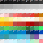
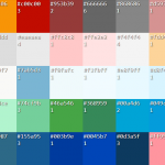
After collecting all the variables there were over 150 different colors being assigned throughout the product. Part of making a themable stylesheet is consolidating the colors into a more manageable set of colors. To get a feel for the colors and how it could be minimized I created a quick page to visualize the palette I was working with. Sorting a HEX color swatch palette. In the end I was able to reduce the color set to just 41 different colors. The majority of those colors are lighter or darker versions of any particular color for highlight states and lots of gray.
Then the idea was to redefine all other variables with another super-set of variables with reuse and extension in mind. Starting with the most generic DOM CSS properties like text, background-color and border-colors before working becoming more and more specific. I used the not-so-creative prefix of @theme for the super-set variables and tried to stick to defining variables by the widget or type of component being styled. So the dropdown colors used the main @theme-border-color but the product specific context menu inherited dropdown colors but adding new accent colors for that widget.
One particularly difficult element to color was the Bootstrap icon image file which I wanted to be able to invert or color to a particular end color. This wasn’t a straight forward process using the CSS filter property. MDN’s documentation of the filter property shows how you can color shift the image using functions like hue-rotate, saturation and brightness. I’ll spare you all the leg work I did to take the original image color, the color you want it to be in the end and apply the various filter properties to end up at that color. Here is the final page and code that I used in our implementation. CSS filter generator to convert from base hex color to target hex color
Defining the Baseline Theme Variables
The naming scheme for the super-set theme followed a pattern I pulled mainly from feeling out Bootstrap and thinking about how readable the theme would be in the end. In this example it is a date widget and more specifically the today part of that date widget. The next section closely resembles the CSS properties with the exception of foreground which applies to text and icons that is sometimes actually the widget’s background-color.
                           Item scope Property
                          |----------|----------------|
a {
  background-color: @theme-date-today-background-color: red;
  background:       @theme-date-today-background:       border-box red;
  color:            @theme-date-today-foreground-color: green;
  border-color:     @theme-date-today-border-color:     @theme-border-color;
}
In this example we’re looking at the addition of an element state specificity. The highlight keyword which is used in place of hover, active, focused wherever it makes sense. Another example element state is be disabled.
                           Item scope Property   (State)
a:hover {                 |----------|----------:---------:-----|
  background-color: @theme-date-today-background-highlight-color: blue;
}
Creating the First Themes
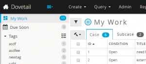
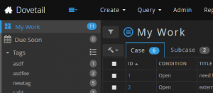
By the time I’d created all the required @theme variables the total count came to just over 130 variables set from those 40 colors and other @theme. This self assignment of @theme variables as things got more specific allow for the customization files to modify far fewer colors to achieve big changes. The main Default theme held over 700 variables in the end but they were all assigned from the first 130 @theme variables. For example the @theme-border-color was reused over 60 times to other various border color variables. The final Dark theme extended the Default theme but only had to redefine 90 variables to get a very smooth final look. Another theme only took 43 variables for another total style makeover. With the help of the most global @theme variables and just a few assignments I also turned off all drop shadows for those two themes for a flat look.
Looking back
The theming project took a few weeks to make and a couple weeks to debug by the time it was ready to go. The focus on theming just the colors of our product was essential to creating a manageable new feature that users could enjoy and developers can customize. The time it takes to create a theme is largely dependent on having a color palette prepared ahead of time. The coding has been reduced to just a day or less for creation and testing. I’m going to write a follow-up post focusing on just what it takes to create a theme because it can be very involved depending on how creative or specific you’d like to get. I’m overjoyed to have implemented this feature after having it so long in the back log and I hope my overview here gives you the confidence to implement your own custom theme solution. Thanks to my great team at Dovetail Software for all your help and support!
