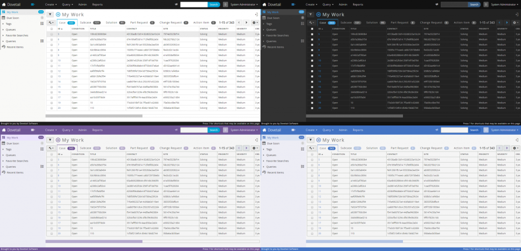
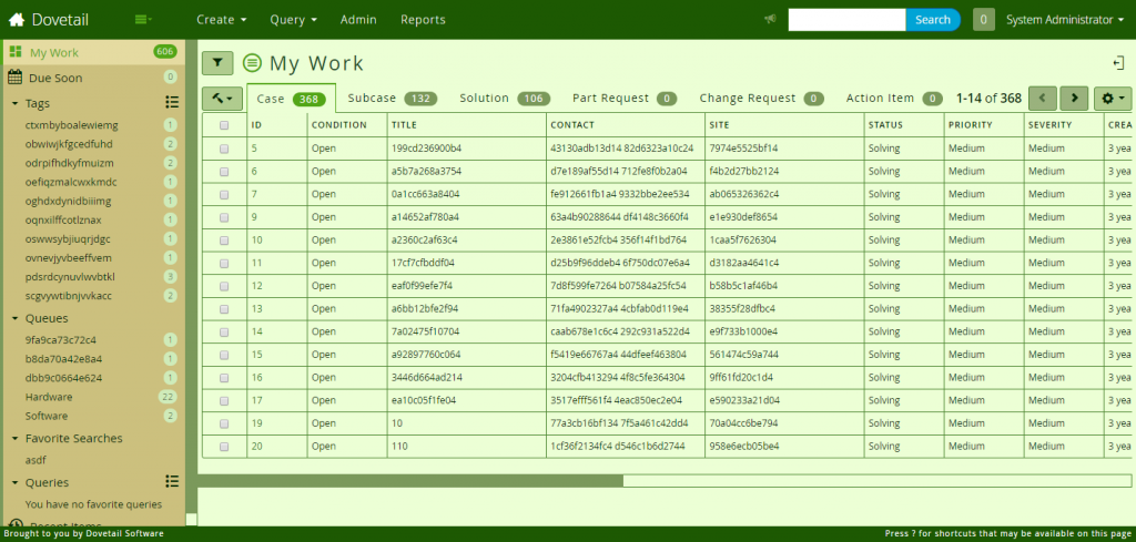
In a recent post named “Merging Multiple Style Sheets to Support Themes” I detailed the journey undertaken to add theme support to the Dovetail Agent product. Now you’ll learn the basic process to creating a theme tailored to your company’s branding. We’ll start by installing or setting up any tools we’re going to use. The first part of creating our theme will be making a design plan and identifying the color scheme we’re going to use. Then we’ll look to see what existing theme there might be which we can lean on and extend to suit our new theme. After that we hit the keyboard and put our theme into code. Finally we need to do some configuration to make our newly created theme an option for our users to enjoy. In an effort to be along your side during this process I’m creating a new theme as well so I’ll be able to smooth out any bumps you might encounter.
Collecting our Build Tools
Let’s get the tools we’ll need to make our theme. The goal is to streamline our development process by automatically re-compiling our theme when we save changes to the file and once that is done automatically refreshing our browser window to reflect those changes. I’m assuming at this point you already have followed the Dovetail Agent Developer Setup Guide and have no problem running the product. Now we’ll need to install gulp globally using the command npm install -g gulp. This will allow us to run the command gulp less-watch from the root folder of our project. This gulp task compiles our LESS files and then watches those files for changes. When it detects that we’ve changed a file it will automatically recompile the LESS files for us. Additionally this task will attempt to notify a browser plugin called LiveReload that the page we’re on needs to be refreshed. You can download the LiveReload extensions for Chrome and Firefox. Once you’ve got Agent open in the browser and you have the gulp less-watch task running you just activate the LiveReload plugin and it will start listening for the reload notifications from our gulp task. Now we can just edit, save and when the browser has reloaded we can see our changes! This will make theme development much easier.
Finding our Theme Colors
Any good theme will start out with a solid plan and a general set of colors. The first couple of themes used seed color palettes from the code highlighting schemes in my editors Sublime Text and Visual Studio Code. For this new theme I’ve leaned on the Adobe Color CC tool that allows you to create completely custom palettes or follow various color rules to assist you in picking colors that work well together. You can also use the search feature of this tool to find other popular color schemes and that was how I found the “Golf Course” color set that I’ll be using as my inspiration. You’ll want to consider colors for the background, foreground, links and a primary accent color. Additionally there are colors for positive responses from the server and errors as well that we’ll have to add in to our theme. All of our secondary colors will come from derivations of this main palette and we’ll continue to reference back to this color tool to keep the theme together. Your theme doesn’t have to use all the colors either! This just gives us a good starting point to build from.
The colors for our theme will help us to pick our starting point from where we’ll begin coding. If our theme was darker, perhaps based off an idea of “Space Flight” or the “Ocean Depths“, we’d probably use the Dark theme as our starting point because the color assignments would already be based on the idea of a light foreground color onto of a darker background color. The Golf Course theme we’re working on will have an overall lighter look and a darker foreground color over a light background color. In this case we’ll be used the default Dovetail Agent theme as our starting point. In any case and with any colors I highly recommend using an existing theme as a springboard. The reason is that many of the hundreds of assignable variables extend off of other variables which allows for a minimal modification of colors for a maximum cascade of effect.
Breaking Ground
To break ground with our Golf Course theme we start by adding a new LESS file named Golf Course.less to the folder /styleguide/styles/less/themes/. The first line of this file will import the theme we’d chosen to extend from and in our case our file will look like this. You don’t need the ASCII text but I think it looks fun. If you’d like to add it as well I used this Text to ASCII Art Generator.
@import "../agent/a5-theme";

/**
 *    ____       _  __    ____
 *   / ___| ___ | |/ _|  / ___|___  _   _ _ __ ___  ___
 *  | |  _ / _ \| | |_  | |   / _ \| | | | '__/ __|/ _ \
 *  | |_| | (_) | |  _| | |__| (_) | |_| | |  \__ \  __/
 *   \____|\___/|_|_|    \____\___/ \__,_|_|  |___/\___|
 *
 */
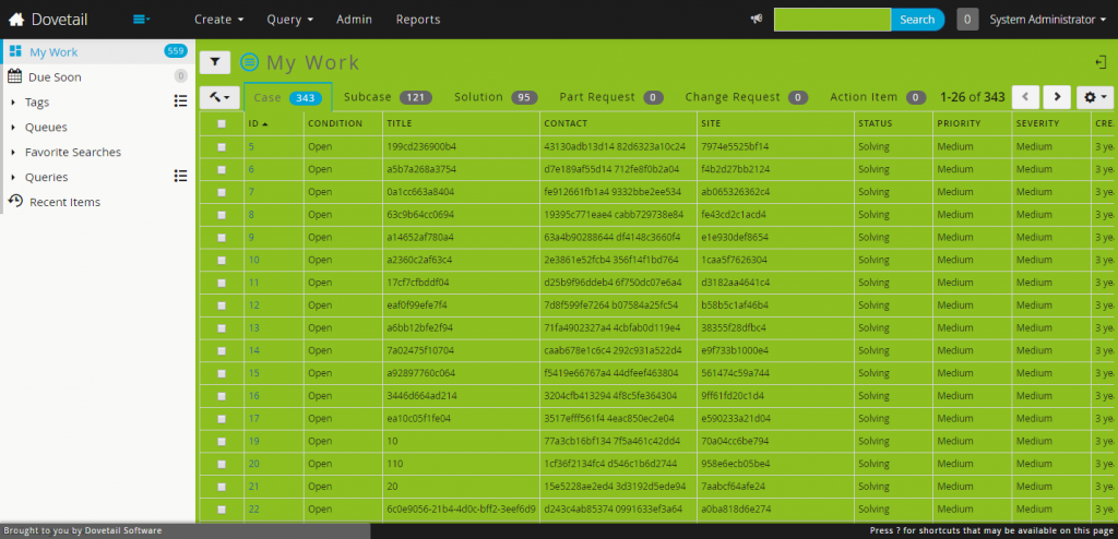
Now that the theme file exists we can fire up the theme compilation and change watch process using the command gulp less-watch. We have to leave this command window open so that it can detect when we save our theme file to automatically recompile our LESS and trigger the LiveReload plugin of our browser to reload the page. This gives us a very quick feedback loop which really speeds up the development of our theme. Our Dovetail Agent user needs to be able to see our new theme so a little configuration is needed. Sign into your locally running instance of Dovetail Agent as a user with privileges to use Admin and edit User Defined Lists. We’ll want to add the option of Golf Course to the Themes list. Note here that the option we add matches the name of the file of our theme. We’ll need to refresh the cache for Agent in the Admin section for the option to appear. Now login as your test user, go to the Preferences page and select our new theme we added. The stylesheets reload and we see … the default theme. Which is perfect! We’ll test out that everything is working by adding the variable definition line @theme-background-color: #8CBF1F; to our theme file and saving. If you have the window open that was running the gulp less-watch process you’ll see it running. It isn’t pretty but we know for sure we’re on the right path.
How Theme Variables are Named
Let’s just remove that last line and we can get started on our theme. The main set of variables for a theme are all prefixed with @theme. As a reminder here is the pattern that is used when reading or creating new variables. In this example it is a date widget and more specifically the today part of that date widget. The next section closely resembles the CSS properties with the exception of foreground which applies to text and icons that is sometimes actually the widget’s background-color.
                           Item scope Property
                          |----------|----------------|
a {
  background-color: @theme-date-today-background-color: red;
  background:       @theme-date-today-background:       border-box red;
  color:            @theme-date-today-foreground-color: green;
  border-color:     @theme-date-today-border-color:     @theme-border-color;
}
In this example we’re looking at the addition of an element state specificity. The highlight keyword which is used in place of hover, active, focused wherever it makes sense. Another example element state is be disabled.
                           Item scope Property   (State)
a:hover {                 |----------|----------:---------:-----|
  background-color: @theme-date-today-background-highlight-color: blue;
}
From here you can easily experiment with the different variables and what effects they would have on our theme. For example setting @theme-accent-color to #8CBF1F would change active tab colors and hamburger menus on the console page. Setting the same color of
 #8CBF1F to @theme-foreground-color would change all our text and non-active icon colors.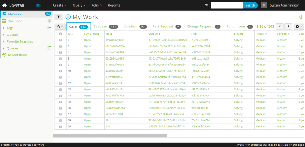
Coding the Theme
Now we’ll look at the finished Golf Course theme file where I’ve added in comments for each assignment we need.
@theme-background-color: #ECFFD5;
Right out of the gate we needed another color. I didn’t want the main background color to just be #FFF but I also wanted it to say in our chosen theme. Heading back over to the Adobe Color CC tool I picked out the a color based on one of the 5 colors we’d picked as our base. Then we select the HSL mode and we can adjust the saturation and luminosity of the color while staying in the same hue to get a close to white background color.
@theme-background-highlight-color: #cfebb9;
The background highlight color in this case is just a hair more saturated than the background color and is used for overlapping areas like a form background color.
@theme-foreground-color: #022601;
The foreground color is used for the text and icons of the site and is straight from the main color selection.
@theme-foreground-muted-color: #7B995B;
@theme-foreground-muted-highlight-color: #718C53;
The foreground muted and muted highlight colors are used in disabled states, when elements exist but are empty and when something exists on the page but doesn’t want attention drawn to it.
@theme-border-color: #4C8530;
Nothing special to say about the border color other than it is very widely used as the default color for lines that separate content.
@theme-accent-color: #53A617;
As pointed out above the accent color is the active color state for foreground text, badges and icons.
@theme-glyphicons-filter: brightness(0) saturate(100%) invert(12%) sepia(69%) saturate(600%) hue-rotate(70deg) brightness(94%) contrast(105%);
Here is the craziest CSS property in the bunch. This is a filter property that allows us to tint the Bootstrap icon graphic to our color of choice. In this case we wanted the graphic file to be #022601 which matches the foreground color. The Bootstrap icon file starts out as #333 though. The first part of this property brightness(0) saturate(100%) makes the graphics black or #000. The second part is a calculation I couldn’t hope to come up with on my own and thus I have prepared a calculator for us to use. The CSS filter generator to convert from black to target hex color can get us the proper filter assignment we need. You might have to run it more than once to get a close assignment as it calculates just how close it was able to get to our target color.
@theme-link-color: #257303;
@theme-link-highlight-color: #1D5902;

@theme-foreground-emphasis-color: #194C1F;
@theme-foreground-accent-color: @theme-link-color;
@theme-foreground-accent-highlight-color: @theme-link-highlight-color;
These colors are for links and where we’ll assign non-link emphasis to text. Like headers or the tree views.
@theme-sidebar-background-color: #CCC07E;
@theme-sidebar-background-highlight-color: #E5DBA1;
@theme-sidebar-more-background-highlight-color: @theme-sidebar-background-highlight-color;
@theme-sidebar-foreground-highlight-color: @theme-accent-color;

@theme-navbar-background-color: #1D5902;
@theme-navbar-foreground-color: #fff;
@theme-navbar-broadcast-toggle-background-color: @theme-neutral-background-color;
The sidebar and navbar variables are pretty straight forward. Only the broadcast-toggle color here is modified to add contrast to the broadcast button when there are no active notifications.
@theme-tab-background-highlight-color: #DCFFB2;
This changes the hover color on the tabs and is later used as a background color for other elements to set them apart from their own content.
@theme-badge-inverse-background-color: @theme-background-highlight-color;
@theme-badge-inverse-foreground-color: @theme-foreground-color;
The main place for the badge inverse colors are the badges in the sidebar.
@theme-badge-background-color: @theme-foreground-muted-color;
@theme-badge-foreground-color: @theme-navbar-foreground-color;
The default non-active badge colors.
@theme-well-background-color: @theme-neutral-background-highlight-color;
@theme-well-background-highlight-color: @theme-neutral-background-color;
@theme-well-accent-background-color: @theme-tab-background-highlight-color;
@theme-well-accent-background-highlight-color: @theme-background-highlight-color;
The well colors are used to separate content sections from their background content areas like the workflow actions or filter selection areas.
@theme-well-inverse-background-color: @theme-well-background-highlight-color;
@theme-well-inverse-foreground-color: @theme-foreground-color;
These inverse wells mainly affect the modal view header colors.
@theme-neutral-background-color: #B0CC8E;
@theme-neutral-background-highlight-color: #9AB27D;
@theme-neutral-foreground-color: @theme-foreground-color;
The neutral background and foreground colors are primarily used on the non-emphasis buttons across the product.
@theme-avatar-initials-color: @theme-background-color;
@theme-avatar-border-color: @theme-border-color;
@theme-info-background-color: @theme-tab-background-highlight-color;
@theme-info-border-color: @theme-border-color;
@theme-info-color: #1D5902;

@theme-modify-background-color: #1D5902;
@theme-modify-background-highlight-color: #4C8530;
@theme-modify-foreground-color: @theme-button-foreground-color;

@theme-modify-inverse-background-color: #4C8530;
@theme-modify-inverse-background-highlight-color: #53A617;
@theme-modify-inverse-foreground-color: @theme-navbar-foreground-color;
The info and modify colors are similar to the well colors in that they represent inner sections of content. The modify colors are used on the “plus one” actions in tabs and on the context menus.
@theme-dropdown-background-color: @theme-tab-background-highlight-color;
@theme-dropdown-background-highlight-color: #53A617;
@theme-dropdown-background-highlight-end-color: @theme-dropdown-background-highlight-color;
The dropdown menus across the product needed to have a little more pop in their colors.
@theme-input-background-color: #fff;
The input background color blended too much into the background so we lightened it to white for added contrast when filling out forms.
@theme-box-shadow-color: transparent;
@theme-box-shadow-inverse-color: transparent;
@theme-text-shadow-color: transparent;
@theme-text-shadow-inverse-color: transparent;
@theme-info-input-active-shadow-color: transparent;
@theme-neutral-shadow-color: transparent;
@theme-error-input-active-shadow-color: transparent;
Removing all the shadows!
@tableBackgroundAccent: @theme-sidebar-background-highlight-color;
Here is one assignment directly to a Bootstrap variable for the user profile page’s alternate table row highlight color.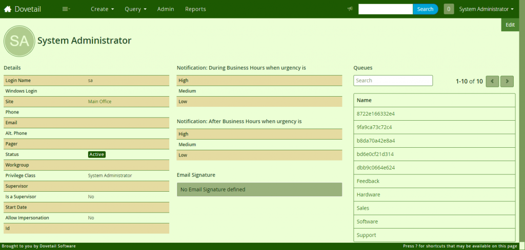
@a5-markdown-upload-instructions-background: @theme-well-background-highlight-color;
This last property was set to add contrast to the instructions section at the bottom of the markdown editor where file uploads are available.
Admiring our new Theme
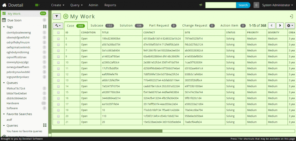
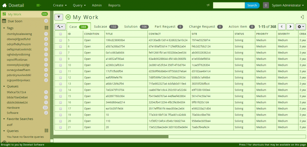
We’ve finished our Golf Course theme for Dovetail Agent! Just 59 variable assignments and 15 new colors gives us a completely different look to the application for our users to enjoy. Sit back and congratulate yourself on a theme well built. Now we release it to our testers and test users to get help in finding anything we might have overlooked. Here is the completed Golf Course theme.
